 SEO & Accessibility
 AI
 Localization
 Ecommerce
 Forms
 Fields
 Development
 Security
 Templating
 Performance
 Control Panel
 Widgets
 Assets
 Utilities
 Mailer Adapters
 Social Networking
 Integrations

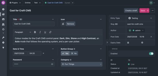
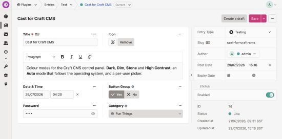
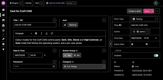
Colour modes for the Craft CMS control panel.
Themes, a contrast switch and a primary button colour, chosen per user with site-wide defaults. Themes override the colours Craft already uses, so templates stay untouched and there's no flash on load.
🚧 Cast is in beta.
Which version?
| Cast 2 | Cast 1 | |
|---|---|---|
| Craft | 6 | 5 |
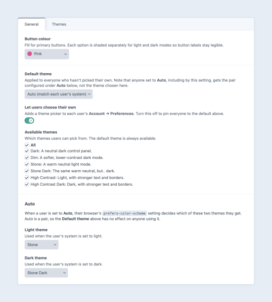
| Light and dark | Craft's own Theme preference, Cast styles each | Added by Cast, with Auto following the OS |
| Themes | Stone, Dim, seven colour themes, and your own from one colour | Dark, Dim, Stone, Stone Dark, High Contrast, High Contrast Dark |
| High contrast | A switch, in either mode | Two themes |
| Button colour | Per user | Site-wide |
The right version installs for your Craft version, and upgrading carries users' choices over.
Cast 2 for Craft 6
Each user picks beside Craft's Theme field in their preferences:
- Light and Dark Appearance: Craft's own, Stone (warm neutrals, Craft's exact contrast), Dim (softer, for long sessions), or a colour theme: Red, Amber, Green, Teal, Blue, Violet or Pink, each tinting Craft's neutrals and focus ring at Craft's exact contrast.
- Primary Button Colour: Craft's blue, Craft Red (Craft 5's), or six more, all readable in both modes.
- Increase contrast: stronger text, borders and focus rings, on top of any appearance.
Custom themes: make a light and dark theme from one colour in the plugin's settings, and preview it before saving.
Admins set the defaults, which themes are offered, how strongly the colour themes come through, and whether users can choose. Add your own themes as stylesheets in cast-themes/, or register them from a plugin.
To install this plugin, copy the command above to your terminal.
This plugin doesn't have any reviews.